you might remember the bus ad i posted awhile back, well it was scrapped and this is it's replacement. 
finally finished tweaking my Don Quixote titling. got rid of the dark red because it looked bad w/ a black background. the project was to design a title for the film version of whatever book we were assigned. the type was built from the ground up. spent a lot of time making it all work. hopefully if i get some free time i can build out the rest of the alphabet. had a lot of fun doing that. 

Tuesday, November 30, 2010
work work work
Saturday, November 13, 2010
FILTERED
Dear Comics,
Just because you CAN use a photoshop filter does not mean you should. As an example i took 5 min to change up the dress for Spider-Man Fever.
There are a ton of problems w the one i did, but reducing the amount of fonts and drop shadows and outerglows helps it read much better. With Chip Kidd, Tom Muller, Todd Klein, and Rian Hughes available, there isn't much of an excuse.
Comics have some great design going on. The recent Batwoman Elegy trade was gorgeous and had a ton of smart JH Williams III goodness happening. The problem is that Marvel and DC and countless other publishers are pumping out tons of other work that just seems to get slapped together which makes no sense because it doesn't help the cover art shine like it should.
Thankfully it seems the tide is turning, some of us just wish it would do so faster.
Monday, November 8, 2010

Saturday, October 30, 2010
THE WHEELS

working on a project for school for a hand drawn back to school ad. the issue is that i need to have 75% typography and this isn't there. can't wait to scrap this and start over.
Wednesday, October 20, 2010
WHAT'S THIS?

was digging through my hard drive for portfolio work and found this. having trouble remembering what it was for, but i have to say, i would totally live there. didn't realize i was capable of doing stuff like this.
Tuesday, October 5, 2010
THE PEN TOOL IS MIGHTIER
For my typography class we needed to choose a well known public figure and design a two page magazine spread using primarily type to tell a story about our chosen public figure.
Beck is of course well known and rather divisive, so this is what I have so far. 
Seems awfully on the nose, but he is I suppose.
Monday, September 20, 2010

The Lives of Others

I finally got around to seeing The Lives of Others tonight. A scant 3 years after it won an Oscar for Best Foreign Picture. You can never be too late to a party I suppose.
The movie takes place in East Berlin during the year 1984. The Socialist Republic of E. Berlin is controlled by the Stasi. The Stasi were a secret police who maintained order through a vast spy and informant network, often composed of the republic's citizens. It has become famous through the sheer amount of paperwork that was preserved. Every t crossed and i dotted. In this society of stifling bureaucracy and observation we follow the lives of two artists who have just been placed under surveillance.
The story is incredibly quiet and subdued, often feeling stifling in it's tension. You spend so much of the story just waiting for something to explode you begin to ache. Movies like this are fantastic in the perspective they place on our own lives. Some parts of the movie feel so close to something we can reach out and touch. This tangible evil at the edge of our periphery. You feel claustrophobic at times because you understand what this would be like. You can perceive the surveillance and pressure. This is McCarthyism or Witch Hunts. This is a story that repeats itself over and over.
Lives of Others is a fantastic exploration of the grey in a black and white society; an examination of what happens when someone who identifies so strongly with Black or White finds himself in the middle. There is a beautiful section when one of the leads wonders if someone can hear, really hear, a beautiful piece of music are they really that bad of a person? The film has every element there to be this German apologist period flick about an especially bleak time in humanity but what it ends up being is this quiet nuanced story about finding beauty and in that finding yourself.
We all come with a hole in ourselves. We spend our lives trying to fill that void with anything that'll plug it up. Some of the choices we make are good and some are bad. To fill that empty space with something lovely, something that feels good is the only way to really do it. This movie is about filling voids with beauty, about understanding the choices we make to complete ourselves.
Monday, August 16, 2010
UPDATED!!
It has been awhile... but you know there are things. plus this is a blog after all and it certainly wouldn't be a blog if i didn't let it languish from time to time.
ANYWAY. below is preview art from a very tiny little zine i have slapped together to pass around at the dallas webcomics expo this weekend and the following weekend at the dallas comicon. 
it'll be in black and white of course so ignore that color.
Tuesday, July 6, 2010
FLASHY

Logos i am working on for my kickball team. Hope to do something as an iron on. Was using Euro Football Club logos as inspiration for most of these. Hopefully i can assemble together some process on this.
Also i have made the finals in a contest through Jarritos Soda. You can find my two submissions here: Jarritos Flavor City
If you happen to be in LA they will be framed and hung in a gallery which is probably detailed on that site.
Monday, June 28, 2010

Tuesday, June 8, 2010
CHOMPSY

I saw a cool illustrationby Theodoros Pelecanos of the Ouroboros. Inspired me to jump into Illustrator and make this. Click on the image for the larger res file.
HE HATES THOSE CANS
Preview of business cards I just put an order in for. 5 alternate fronts and the info back. 

Figured they were needed to go along with the website I set up for myself. Also decided I should take myself, and my professional development a little more seriously. Currently the website is just aggregating my blog, Flickr, and Twitter accounts, but hopefully soon it can also be a portfolio display tool.
Monday, June 7, 2010
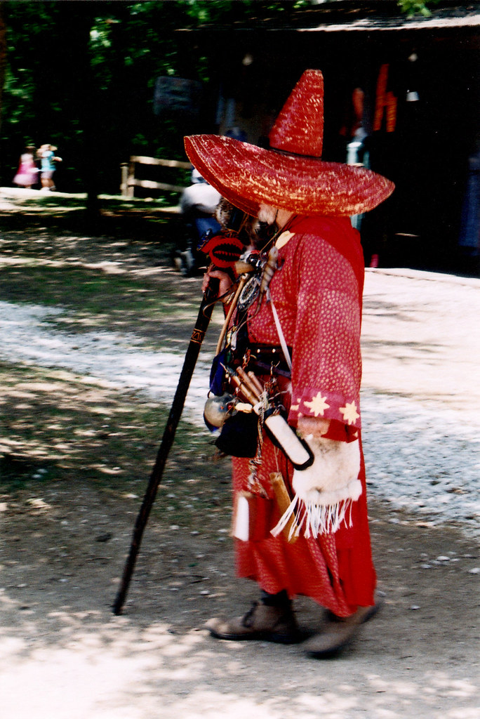
PICKTURES
Two new albums up on my flickr with photos from Scarborough Renaissance Faire and some stuff i shot randomly throughout March. Click on the pictures below for the respective Sets. 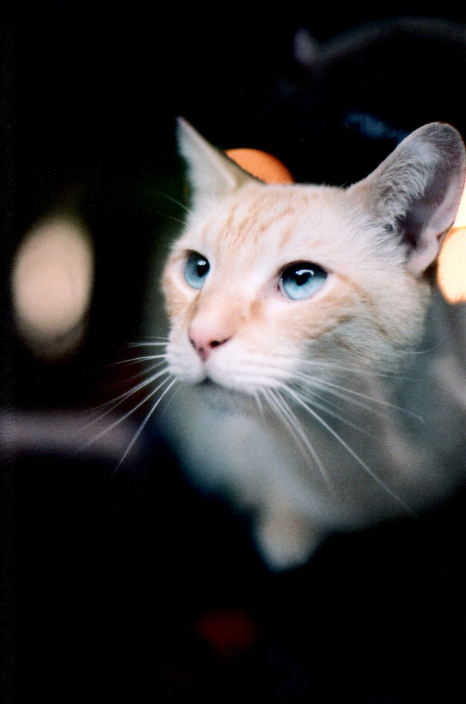
Saturday, June 5, 2010
ASTRO POOL
found a great image in the NASA archives and sketched a drawing from it as reference. wasn't even close, but you know. slapped some color on for the hell of it. it's a mess... 
Friday, May 28, 2010
ETERNAL BATTLE
Apropros of nothing... a second Friday sketch! 
Gorvon the Invincible locked in mortal combat with the mischevious Master of Sludge.
SWOOSHING
Jay Garrick's Flash costume was always so bizarre. but you know... what can you do. 
colored in Photoshop, 15 min. happy friday, oh and enjoy your long weekend.
Tuesday, May 18, 2010
LOREM IPSUM

The Beauty Of Typography: Writing Systems And Calligraphy Of The World
This is a really fantastic article by Smashing Magazine detailing the ins and outs of the writing systems of the world. A ton of awesome information here and a some really cool examples of the differences in writing that we aren't often exposed to.
Also speaking of far off places... Check out Phillipino artist Twistedfork. 

Thursday, May 13, 2010

Thursday, May 6, 2010

Tuesday, May 4, 2010
TRIUMPH OF FOODSTUFFS

latest class assignment for Illustration. hope you enjoy. can't wait to get this printed at full 11x17 size.
Wednesday, April 28, 2010
KEYHOLE
little peek at an illustration i am working on right now... 
also the govt has lost an experimental, and prob grossly expensive, glider. oops!
Air Force's Falcon Hypersonic Glider Disappears Mysteriously
check out these childrens drawings created somewhere in the 11-15th century.
Art of Onfim
Friday, April 23, 2010

Wednesday, April 21, 2010
GNARLY

quick inked sketch i ruined in Photoshop. the texture on the troll pants came out kinda cool though. good ol rust!
Thursday, April 15, 2010
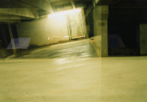
CLICK
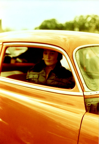
Ok so i just got the pictures i took in Austin over this past weekend all scanned in.
Shot everything with my trusty Nikon FT3 and used an old roll of Lomo Redscale film i had in the fridge. As a surprise, i took an entire roll of film and every picture actually came out... now if i can just work on my composition skills.
Tuesday, April 13, 2010
FOR FREE

Fontfrabric released Solomon and for a limited time is giving away the regular version of the font. Go grab a download before it expires.
Solomon Font
Wednesday, April 7, 2010
SLURP

You know... just chilling at the aqueduct. Did this illustration for class, would like to get a nice big print done to mount for class presentation.
Monday, April 5, 2010
TRASHBIN
These illustrations are both not done, but will never get used for their orig purpose. So sad to see them go in the dustbin. 

Friday, April 2, 2010
APRIL FOOLS ROUNDUP
Ok so another underwhelming April Fools Day full of pretty meh jokes. There were three standouts for me this year though:
1. The Under Consideration refresh of the Dunkin Donuts logo which was done so well it was plausible. ![]()
Dunkin Donuts Refresh
2. The Secret Behind Nike Air
3. Tech Crunch's April Fools joke wasn't very interesting or funny... but it ended up becoming funny when the NY Times demanded they takedown the article!
NYTimes Request Correction/Removal Of Our Post. We Decline.
Friday, March 26, 2010

Thursday, March 25, 2010
BANG BANG BANG
I don't even know where to begin with this... i mean these are the very serious repercussions of violence between cheese aliens and pepper aliens.
Thursday, March 11, 2010
KNOTZ

This was an unused scrap from some work this week. Thought i would color it and fancy it up some.
Also go read this article on education reform which, though very long, very very good:
Building a Better Teacher
Wednesday, March 10, 2010
SOMEBODYS WATCHING ME

This looks like a normal building... but there is a surprise. The bosses office is an elevator that travels from top to bottom of the building so he can survey workers in all aspects of the process. Go check out the entry on this crazy building at Anarchitecture. Totally awesome scale model involved.

Tuesday, March 9, 2010

Friday, March 5, 2010
TAPED

Made this as a test this afternoon. Completed in Ill CS4 in 30 min. Click on image to see larger.
Paper texture courtesy of DeviantArt user DJSOUNDWAV
Tuesday, February 23, 2010
NOT A MOON
also not very well done. but whatever. learning the type tool today in class. 
starfield courtesy of flickr user Zoeff
Monday, February 22, 2010


HULK SMUSH

Icarus- Hulk- The Marvel World of Icarus
This is a song from this crazy psychedelic Marvel Comics album.
Description from Amazon:
One of the rarest major label albums to emerge from the British Progressive Rock underground, The Marvel World Of Icarus was a concept work based around the Marvel Comics stable of superheroes. It came out in 1972, but, according to legend, was immediately withdrawn due to a dispute between record label Pye and Marvel Comics. Taken from the original master tapes, this first-ever official reissue - which includes comprehensive liner notes, band quotes and previously unpublished photos - tells the fascinating story behind the album as well as documenting the wider adventures of Icarus during their 1968-72 existence.I dare you to download and listen. Let me know if you are interested in the album.
Thursday, February 18, 2010
FUTURISTIC
holy crap this is a freaking Animal Shelter. 
picture by Schopia
click on the above to see more. thanks to Daily Dose of Architecture for the link!
Wednesday, February 17, 2010
TESTING TESTING
So enough people are viewing this blog now that i have blown through my free account bandwith on Photobucket. All my crap is broken, and I am thinking that I might just switch over to Flickr and upgrade that account. Testing out hotlinking from Flickr.
Tuesday, February 16, 2010
STUFF FOR YOU
finished up this black and white illustration for class. hopefully i can do some more with it. 
just kinda messing around. 
Subscribe to:
Posts (Atom)

